Skip to end of metadata
Go to start of metadata

You are viewing an old version of this page. View the current version.

Compare with Current View Page History

« Previous Version 10 Next »

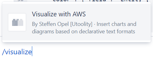
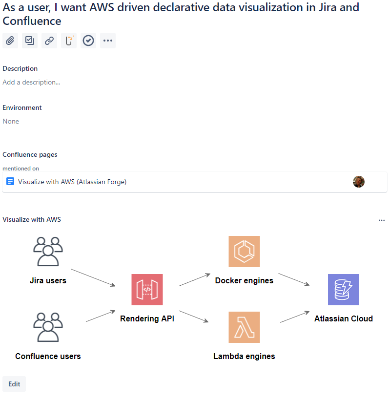
Visualize with AWS allows you to use a variety of declarative languages to visualize any kind of data – maintain and render declarative charts and diagrams as code alongside your Jira issues and Confluence pages.

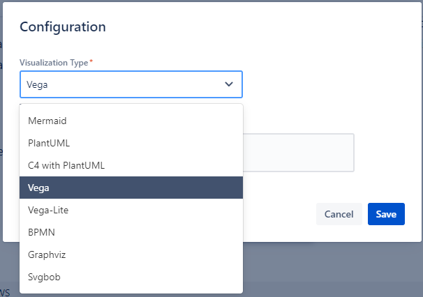
The first iteration supports Vega and Vega-lite, PlantUML (incl. AWS and C4 modes), Mermaid, Graphviz, and for the fun of it we’ve thrown in Svgbob for ASCII graphics.

Getting started

Diagrams can be provided and edited inline, or referenced via URL for more complex ones or dynamically updating charts and diagrams (down the road we want to separate the so far combined visualization and data source declaration) – let’s see how it works:

Supported visualization languages

Refer to Visualize with AWS - supported chart and diagram types for details and links to examples, online playground, and Visual Studio Code extensions that ease maintaining diagrams as code.

Samples and Visual Studio Code development container

We have started the https://github.com/utoolity/visualize-with-aws-samples repository to maintain examples used within the apps and in presentations.

The repository also provides a Visual Studio Code development container with extensions providing syntax highlighting and/or live previews for most visualization types.

Relative vs. absolute URLs

Please be aware that many online examples reference the data via relative URLs – to make these work with this app you need to convert the URLs to absolute ones.

Registration required

You currently need to be signed in to your Atlassian Cloud product to edit and view charts and diagrams via Visualization with AWS – please watch and vote for https://ecosystem.atlassian.net/browse/FRGE-189 to raise Atlassian’s priority to address this limitation.

How it works – Confluence

In Confluence the app provides a macro via the Macro module:

You can then select from a variety of declarative chart and diagram rendering engines:

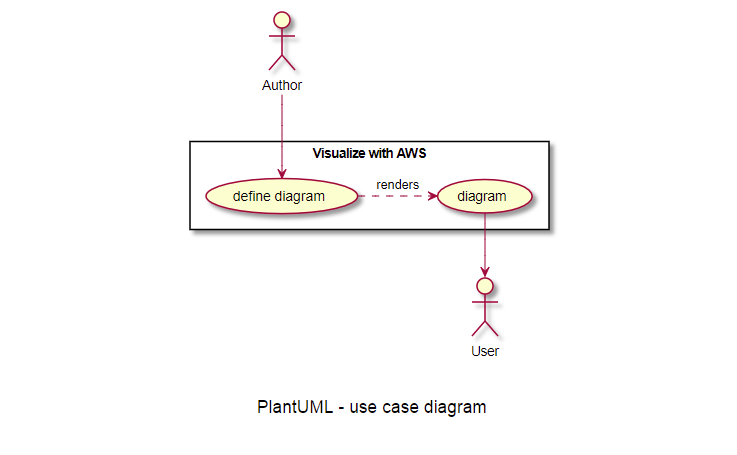
You can see it in action right here with a small PlantUML example:

A PlantUML use case diagram

Here’s the inline source:

 PlantUML use case diagram source
top to bottom direction
actor Author
actor User
rectangle "Visualize with AWS" {
  Author --> (define diagram)
  (define diagram) .> (diagram) : renders
  (diagram) --> User
}
@enduml

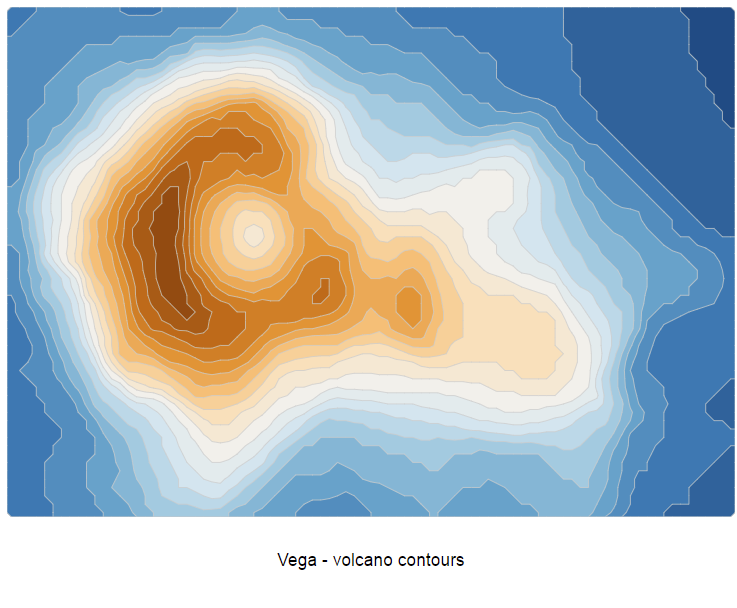
Let’s try something more fancy via the impressive Vega renderer:

A Vega volcano contours visualization

This time I’ve provided the data and diagram as an URL via a Bitbucket Snippet for ease of use, even though it could still be defined via JSON inline in principle:

 Vega volcano contours diagram URL
https://bitbucket.org/!api/2.0/snippets/utoolitylabs/MKLe9j/e03ee4996eec6566130666433ae2897f1f384ff8/files/snippet.json
 Vega volcano contours diagram source
{
  "$schema": "https://vega.github.io/schema/vega/v5.json",
  "description": "A contour plot of the Maungawhau volcano in New Zealand.",
  "width": 960,
  "autosize": "none",

  "signals": [
    {
      "name": "grid",
      "init": "data('volcano')[0]"
    },
    {
      "name": "height",
      "update": "round(grid.height * width / grid.width)"
    },
    {
      "name": "smooth", "value": true,
      "bind": {"input": "radio", "options": [true, false]}
    }
  ],

  "data": [
    {
      "name": "volcano",
      "url": "https://vega.github.io/vega/data/volcano.json"
    },
    {
      "name": "contours",
      "source": "volcano",
      "transform": [
        {
          "type": "isocontour",
          "scale": {"expr": "width / datum.width"},
          "smooth": {"signal": "smooth"},
          "thresholds": {"signal": "sequence(90, 195, 5)"}
        }
      ]
    }
  ],

  "scales": [
    {
      "name": "color",
      "type": "linear",
      "domain": [90, 190],
      "range": {"scheme": "blueorange"}
    }
  ],

  "marks": [
    {
      "type": "path",
      "from": {"data": "contours"},
      "encode": {
        "enter": {
          "stroke": {"value": "#ccc"},
          "strokeWidth": {"value": 1},
          "fill": {"scale": "color", "field": "contour.value"}
        }
      },
      "transform": [
        {
          "type": "geopath",
          "field": "datum.contour"
        }
      ]
    }
  ]
}

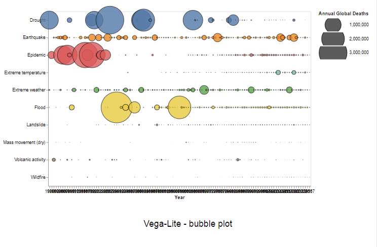
Now that syntax is certainly already a bit complex, which is why the sister project Vega-Lite offers a more concise one too:

A Vega-Lite bubble plot example

 Vega-Lite bubble plotb diagram source
{
  "$schema": "https://vega.github.io/schema/vega-lite/v4.json",
  "data": {
    "url": "https://vega.github.io/vega-lite/examples/data/disasters.csv"
  },
  "width": 600,
  "height": 400,
  "transform": [
    {"filter": "datum.Entity !== 'All natural disasters'"}
  ],
  "mark": {
    "type": "circle",
    "opacity": 0.8,
    "stroke": "black",
    "strokeWidth": 1
  },
  "encoding": {
    "x": {
      "field": "Year",
      "type": "ordinal",
      "axis": {"labelAngle": 0}
    },
    "y": {"field": "Entity", "type": "nominal", "axis": {"title": ""}},
    "size": {
      "field": "Deaths",
      "type": "quantitative",
      "legend": {"title": "Annual Global Deaths", "clipHeight": 30},
      "scale": {"range": [0, 5000]}
    },
    "color": {"field": "Entity", "type": "nominal", "legend": null}
  }
}

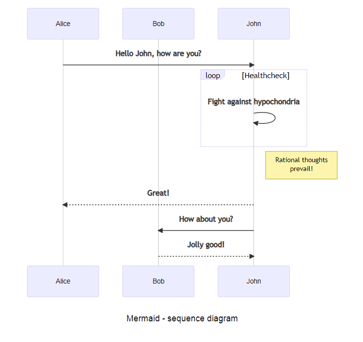
The app also supports the popular Mermaid renderer:

A Mermaid sequence diagram

 Mermaid state diagram source
sequenceDiagram
    participant Alice
    participant Bob
    Alice->>John: Hello John, how are you?
    loop Healthcheck
        John->>John: Fight against hypochondria
    end
    Note right of John: Rational thoughts <br/>prevail!
    John-->>Alice: Great!
    John->>Bob: How about you?
    Bob-->>John: Jolly good!
    					

How it works – Jira

In Jira the app provides a ‘Visualize with AWS’ issue panel:

An applicable example might be an architecture overview via the PlantUML with AWS mode:

Up to five diagrams per issue

The app currently supports up to five diagrams per issue (an Atlassian Cloud platform limit).

  • No labels